Amplify UI
Condé Nast
System design
2019
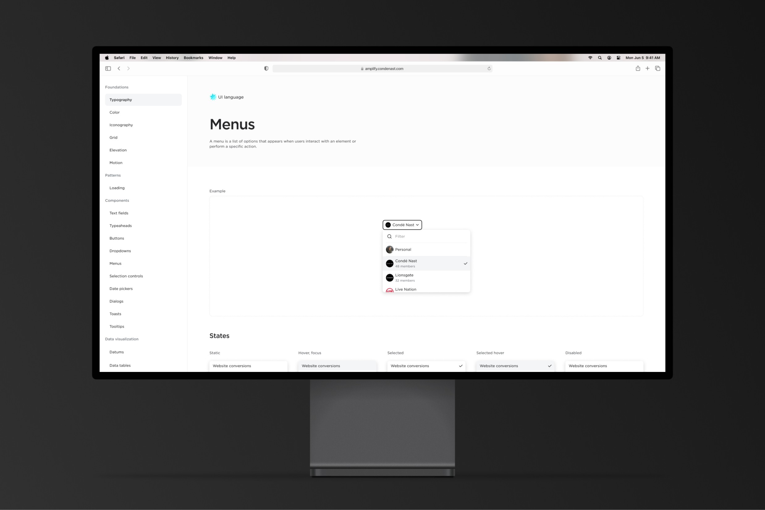
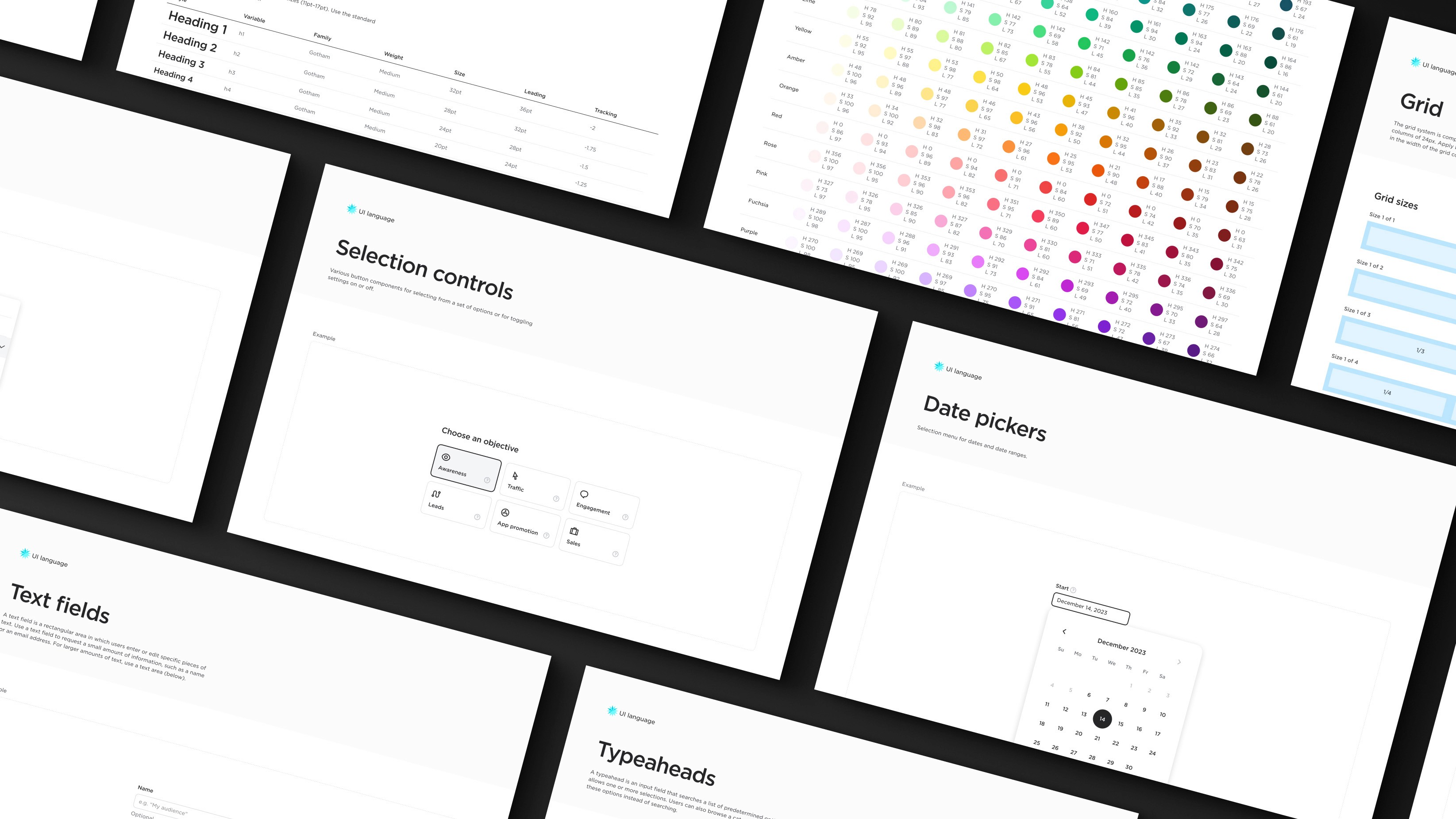
Condé Nast’s Amplify platform is a suite of tools for campaign managers to create, manage and analyze social media ad campaigns. Prior to developing these interfaces, a design language and component system was created to account for all desired capabilities and to ensure consistency across the platform.
The challenge
To account for the capabilities of this platform, the design system needed to facilitate heavy data input, robust asset management functionality, and versatile data visualization. The UI language should also adhere to the accessibility standards Condé Nast holds all of its products to, as well as match the clean and elegant aesthetics the brand promotes. Personally, I also set out to create a system that is easily approachable and not overly complicated or bloated, so that components could be easily implemented and maintained within a small team structure.
Solutions
Laying the foundations
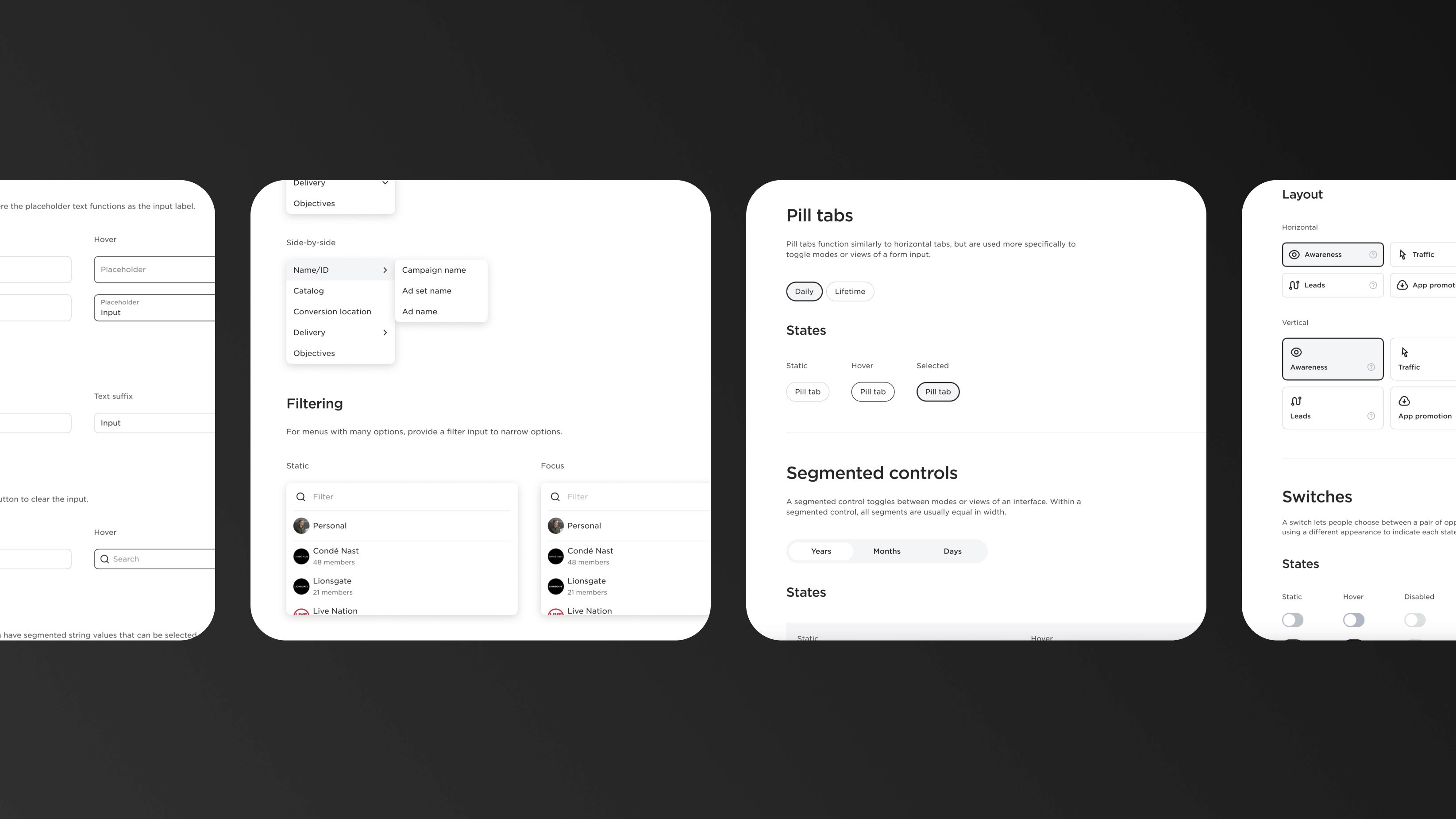
Stylistically, the approach I took was to create a sleek, minimal, high-contrast set of UI elements that hints at a sense of high-tech/AI. In documenting the system, the essential foundations of type, color, grid/units/spacing, elevation and motion were laid out, and a set of common variables — such as standard font sizes, colors, border radii, etc… — were defined. In creating the UI controls, I took into consideration the heavy form input the interface will cater to and made sure to create clear, delineated states for when users had added input to fields so that scanning long forms for certain input would be easier. Generally, input and selections stand out by dark outlines and/or light grey backgrounds.
Verifying accessibility
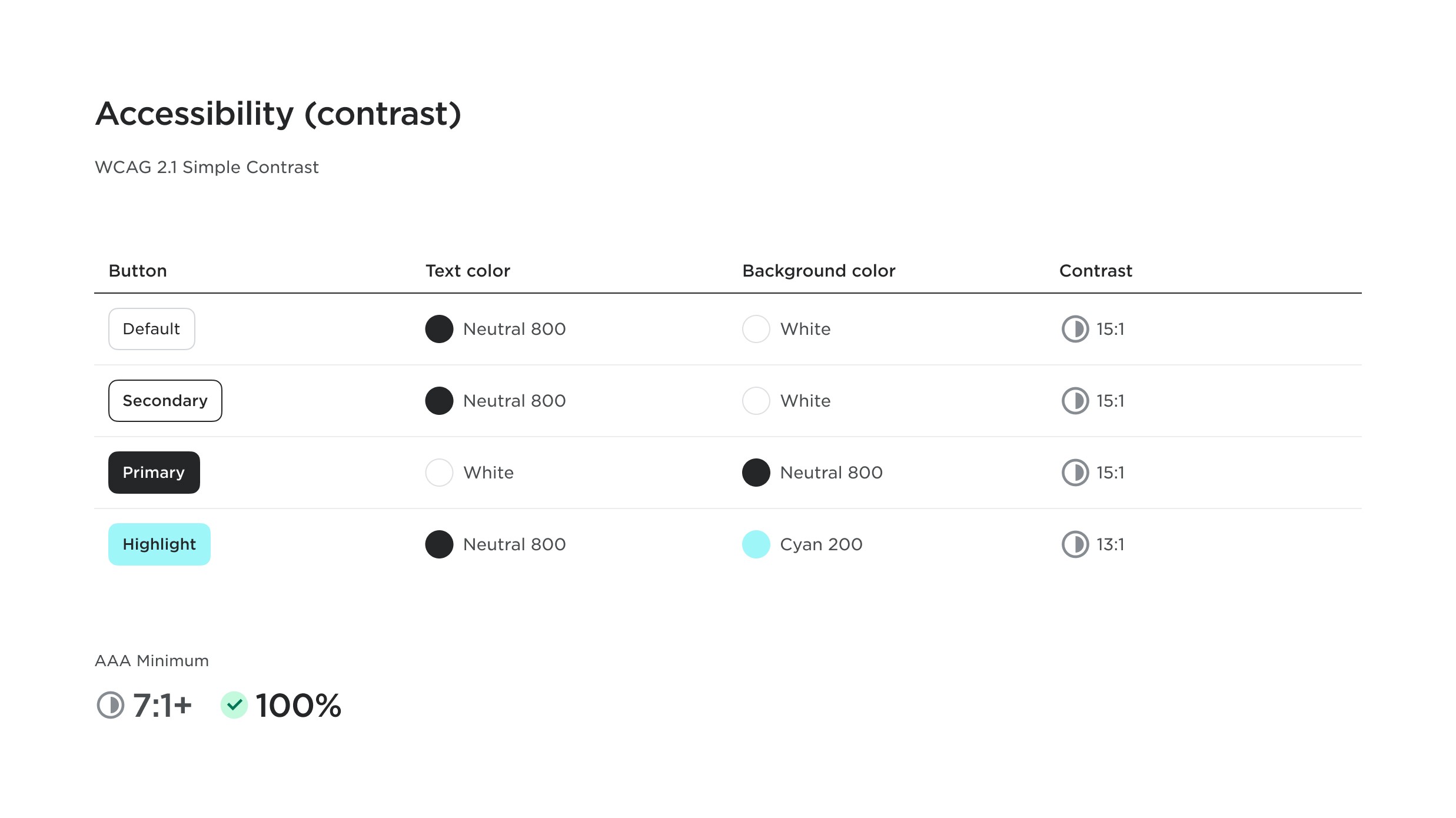
Additionally, I put an emphasis on accounting for accessibility guidelines by checking color contrasts and including focus states for keyboard navigation. All form elements were given clear labels, and guidelines were put in place for tooltips and other user assistance. The system was developed using semantic HTML and interfaces created with this system were verified to meet WCAG guidelines.
Accounting for heavy input requirements
The platform’s interfaces required a large variety of form input controls: long, nested selection menus, various ways to search, sort and filter, and input fields that accommodate many input entries. For the latter requirement, I created a custom input field, which we designated a “typeahead”, and these fields were frequently used for various input instances, such as entering audience interests, demographics, social media pages, and more. When users focus into the field, a menu of possible input options or categories appear until the user starts typing, at which point search results appear. Users may enter and select one or more options at time, and selected options are categorically added above the field and are removable.
Including data visualization guidelines
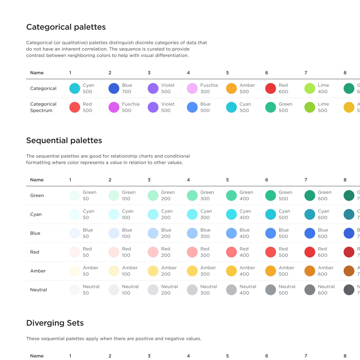
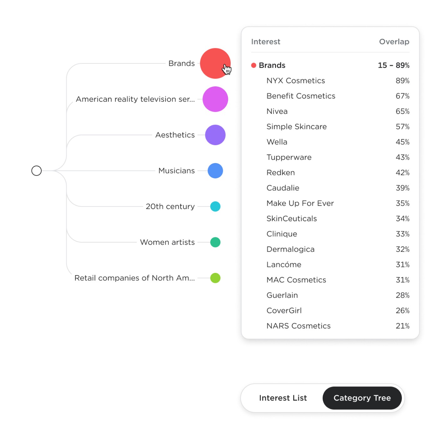
The ads manager platform also provided rich reporting on campaign performance, so a set of flexible tables, charts and other data visualization was included in the UI components. For these components, I included additional color systems (categorical, sequential, divergent, etc) and other chart-specific guidelines.
Impact
Affinity UI successfully provided a comprehensive set of UI components and design and development guidelines to rapidly build out a number of interfaces for Condé Nast's Affinity ads management system. Personally, I set out to achieve not only this, but to perhaps create a system that all Condé Nast data products could share. This however proved difficult, especially when considering the consolidation of different codebases, though such consolidation may still be achieved in the future. Nonetheless, the design system continues to provide a crucial foundation and source-of-truth for Condé Nast ad campaign management globally.
